Quantcast
Channel: Art and Influence
Viewing all 171 articles
Browse latest View live

Perfume Bottles and Chrysanthemums Demo

$
0
0
by
Armand Cabrera


I have almost wrapped up my still life paintings, only two more to go. Fall is shaping up here in Virginia and I am looking forward to getting outside and painting some landscapes.
Painting in the studio is not as challenging as painting outdoors; you have no lighting constraints on you and I have to keep myself from falling into bad habits of organization while painting.  When I started these I was sticking to the same procedures I used for outdoor work. I was developing the whole painting from big to small blocking the whole thing in quickly.
As I have become comfortable with my new routine indoors though,  I've noticed a little back sliding on my part and a slower pace to my work. As you can see with this painting I didn't block everything in at the beginning but sort of bounced around. This will have to change as soon as I get back outside in a couple of days. Weather and the sun moving through the sky should set me back on track pretty fast.


Once I have my setup and theme for the painting I Draw it on my board with a big brush being careful to measure relative sizes for the elements of the image. I compare positive and negative spaces when drawing like this.


I establish the background color and then the blue vase. Once the vase is in  I go back and cool the background a little more. I block in the main masses for the flowers and start one of the bottles.


I get some shadows in for the bottles and vase and start with secondary shapes on all of the elements.


From here I spend most of my time refining the values and temperature changes for the smaller forms and reflective shapes.


I finish up by painting the table cloth and revisiting any edges and shapes that  seem out of place for the overall tone of the piece.


Finished Still Life Paintings

$
0
0
I have finished up my little small works still life paintings.  Prices and sizes with images are posted on my website. Diane has also made a little video of the paintings which you can see there too.

The online show will run through December 15th


                                                  Perfume  Bottles  and    Chrysanthemums
                                                    8 x 10                              Oil on Linen


                                          Artisan Bread and honey      8 x 10       Oil on Linen


                                          Brass Pot and Veggies     8 x 10           Oil on Linen


                                            Dogwood                 8 x 10                  Oil on Linen


                                          Peppers                    8 x 10                  Oil on Linen


                                          Pothos and Wildflowers    8 x 10          Oil on Linen


                                                  Red Rose       10  x 8            Oil on Linen   


                                          Pink Rose              9 x 12                      Oil on Linen


                                         Silver Vase and Rose        9 x 12           Oil on Linen


                                          Pink and Gold           9 x 12                   Oil on Linen


                                          Something Hot              9 x 12               Oil on Linen


                                          Champagne Glow         11 x 14             Oil on Linen


                                          Farm Fresh                11 x 14                Oil on Linen


                                                 Oleander          14 x 11           Oil on Linen


                                         Summer Basket             11 x 14             Oil on Linen 


More Dean Cornwell Quotes

$
0
0


by
Armand Cabrera


More quotes from the Dean of Illustration.These are from a 1926 lecture and were originally written by Horace Gilmore. I am leaving the misspelling and grammatical errors intact. I want to thank Kev Ferrara for hunting these down and sharing them.
 All images are Dean Cornwell.


Suggestion for designing canvas/composition – it is well not to have commonplace placement that is equal parts of foreground, middle distance, and distance. Better to have ample spacing of one or other.
When you use light and shade use it for all there is in it. If making a line drawing, then make it entirely a line drawing.

Have variety of space and shapes. When a canvas is designed it’s impossible to sign it without spoiling it.

Said picture looked as if a camera had just clicked without any thought, (happened to get it that way).


Suggested gasoline to clean canvas.

Picture looked as if it were made from other pictures instead of nature. Go to nature for everything. Natural edge of vignette, tree, edge of leaves.

Illustration perspective is free-hand perspective.


Study still life in different lights, outdoors, in doors, sunlight, etc. Have simple still lifes. Just one or two objects. Observe nature, relative values, and different lights, as moon and sunlight, night etc.

Regarding model in studio, always have picture practically finished before seeking models. Sometimes has model low for working on head, higher for working on body, and still higher for feet to get it as picture is laid in.

Light – (unreadable word – might be “Cornwell”) does part with artificial light, some with sky, related greys, etc.


Ideas that can be told in words are story ideas and not pictorial ideas. Pictorial ideas require consideration of nice design, sweet lovely tones, and color values and light, etc.

Don’t “do” everything. Sort of accent (bring out spots), nice large quick areas, and spots of detail carrying through.

Get the spirit of the picture. Different people have different kind of homes, do/live differently, etc.

Use light sweet high keyed tones for lovely girls, and low tones for men.

Dean Cornwell Notes part 1

Dean Cornwell Notes Part 2

Theodore Kautzky 1896-1953

$
0
0

By
Armand Cabrera


Theodore Kautzky was born in Budapest Hungary in 1896. He attended the Royal University of Hungary studying to become an architect. He Graduated in 1921.


Kautzky married and immigrated to the United States in 1923 and became a full citizen in 1929. He was hired as an architect working for the New York City parks Department. It wasn't long before he established himself as a talented and hardworking artist of the highest caliber. Kautzky began teaching art classes in the 1930’s at Pratt Institute in New York, The University of Pennsylvania, New York University and the University of Toronto.


 He was a well-respected teacher and after the end of World War II he wrote one of the most successful books on watercolor ever published in America. Ways with Watercolor was published in 1949 and is still in print today as a Dover book. He followed that book with Painting Trees and Landscapes in Watercolor which is also still in print as a Dover edition.


Kautzky was also an avid draughtsman and published two books on pencil technique that are also influential and a great addition to any serious artist’s library. The first was Pencil Pictures a Guide to Their Pleasing Arrangement followed later by Pencil Broadsides: A Manuel of Broad Stroke Technique.A combined edition of the two volumes called the Ted Kautzky Pencil Book was published after his death in 1979.

Another Watercolor book Ted Kautzky Master of Pencil andWatercolor was published in 1959 posthumously and is also still available as a print on demand title.


Kautzky was a member of the National Academy of Design, The Rockport Art Association, The North Shore Arts Association and The American Watercolor Society. He won many awards for his work including the Birch Burdette Long Prize for Architectural Illustration, The medal of Honor from the American Watercolor Society in 1941, top prize from the Salmagundi Club Annual Members Exhibition in 1948 for Watercolor and the top prize for oil painting that same year, The Gold Medal from The Allied Artists of America, The Oberg Prize from The National Academy of Design and another top award from the Salmagundi Club 1952.


Theodore Kautzky died unexpectedly after a month long illness at the age of 56 in 1953.


Bibliography

Ways With Watercolor
Ted Kautzky
1949 Reinhold Publishing

The Pencil Book The Combined Edition
Ted Kautzky
1979 Reinhold Publishing

Ted Kautzky Master of  Pencil and Watercolor 
Charles R. Kinghan
1959 Reinhold Publishing

Artists of Cape Ann: A 150 Year History
Kristen Davies
2001
Twin Lights Publishers

Quote
There are certain principles of proportion, balance, rhythm, contrast, etc., that are followed either consciously or instinctively by all artists.These principles can be learned and applied by anyone who is in earnest about wanting to make pictures.Upon how intelligently they are applied depends the excellence of the results.
~ Ted Kautzky


Practice and Process

$
0
0
By
Armand Cabrera
  
"Theory has no place in an artist's basic education. It is the eye and the hand that should be exercised during the impressionable years of youth. It is always possible to later acquire the accessory knowledge involved in the production of a work of art, but never -- and I want to stress that point -- never can the will, perseverance, and tenacity of a mature man make up for insufficient practice. And can there be such anguish compared to that felt by the artist who sees the realization of his dream compromised by weak execution?"
William Adolphe Bouguereau

People are always trying to come up with new ways of learning how to draw and paint. Mostly to sell a book or some other block of information to put money in the authors pocket.  This produces an endless stream of media garbage about drawing and painting in two weeks or how to draw trees or horses or smiley faces. It is usually a scheme to remove the long hours of practice from the equation.

Students spend their time seeking the magical pencil or brush that their favorite artist uses. They are looking for that one brand of paint or canvas to solve their problem. They believe that with the right materials they will be freed from the drudgery of miles of repetitive work needed to succeed.  

The real process of drawing and painting is learning to see in a way that strips away preconceived notions and symbols we accept as truth but are not. It is also learning control of a chosen medium, hand eye coordination and a keen observation of the world and people around us. It is part memorization and construction of known quantities of visual information we have collected.

 Representational art has been around for about two thousand years or more in its current iterations and the best systems of training encourage lots of practice combined with curiosity and experimentation. Practice focusing on small tasks and problem solving leads to a synthesis of ideas and craft toward the formulation of the abilities needed to create a work of art. It is a balance of construction, observation and imagination. Too much reliance on any one part or the exclusion of any one produces inferior work in my opinion. In my thinking, art is the synthesis of fact and symbol, each artist mixes those ingredients in their own measure to arrive at a recognizable truth for the viewer of their work.

I remind people of this because lately I see a lot of younger people interested in art get caught up in measuring. They measure their ability, they measure their aptitude, and they measure their perceived talent. They worry their process is not like someone else’s or their work is or isn't (fill in the blank). All this navel gazing is counterproductive in my opinion and just delays the important work needed to be completed to achieve a level of professionalism as an artist.  I think it is better to just work as hard as you can. Keep your heroes and villains and think about how you will accomplish your goals but stay focused on practice and let process develop naturally.

Crowdsourcing Art

$
0
0


By
Armand Cabrera


Crowdsourcing is one of the biggest problems facing the art industry right now. It exploits the bottom end of the labor pool, and puts pressure on the top end into lowering prices to compete with the rise of free and low paid labor. It is an example of the lottery/ game show mentality of employers nowadays. What I mean by that is instead of having a large pool of  professional labor that employers pay to do work for them, they have abrogated their responsibility and knowledge of craft to the mob. Companies now spend as little as possible on development of products and advertising. Crowdsourcing development is a lottery where chance rules success, not quality.

Edit:
[Instead of paying for book covers, graphic design, interior art, storyboards or any other use of art companies now hold contests that offer exposure or experience as compensation. Some even go as far as to charge the artists for entering these contests instead of paying for services rendered.]


 There are two ways to lower risk; the first is to be very good at what you do. This is difficult and requires long hours acquiring the necessary skills to accomplish whatever goal you have. You have to understand the industry you plan on entering from a development point of view not just as a consumer. You have to understand the components for development. You have to decide on where your entry into this market will be. And if you are an honest person you have to fund it. All of this takes time and money.  

The other way is a gambling approach where you take very little time and effort for each idea and spread them like fertilizer in a particular market hoping something will catch the public’s eye. Crowdsourcing is everywhere in art, the gallery system, online comics, advertising and graphic design, cover and interior illustration just about anything you can think of that uses some form of art has someone or some company out there trying to get it for free or below a living wage.

Someone decides they have an idea and then with no experience or understanding they look for free labor through crowdsourcing to execute their idea. It is trial and error at the expense and time of the people working with them. Most of these endeavors fail mid development leaving the artists with nothing to show for their work. This approach gives you garbage of no lasting value geared towards whatever is trending through the society. To minimize a company’s or entrepreneurs’ outflow of cash, these entities offer exposure or experience instead of living wages for professional work.  The problem is there is no useful experience or worthwhile exposure for making crap. I don’t need to burn my hand on the stove to know that I wouldn't enjoy the experience and when put in the wrong place people die from exposure. Garbage is not made the same way quality is made.

When you are starting out as an artist it is important to value what you do, there are no shortcuts to success. To make a living from art an artist must have ability and a business sense about them or they will be out of business quickly. Undercutting industry standards of living wages through crowdsourcing and unfair working conditions just insures its eventual collapse. 


Illuxcon and an Imaginative Art Marketplace

$
0
0

by 
Armand Cabrera


Illuxcon was an interesting mix of new and old for me. It was fun reconnecting with old acquaintances from my brief illustration career and meeting new people who I have only interacted with online before the convention.  It was exhilarating to see quality imaginative art but frustrating to see prices for quality finished work set so low compared to the gallery world.

Patrick and Jeannie Wilshire and the other people behind Illuxcon are bringing imaginative art to a broader audience with this convention. They are doing this by spotlighting the best traditional artists and sculptors for collectors and fans in a small intimate setting. Hopefully it will raise standards and prices along with that appeal. I think the time for this may be just right if it happens fast enough. It has been tried many times before but has never caught on completely.  I participated in shows at the Delaware Museum in the early 90's with other artists in the field but the shows while well attended did not produce a large enough collector base needed to sustain itself.

What is different this time around is the way entertainment and media have seeped into every part of our lives. It is literally at our fingertips 24/ 7 now, with tablet computers and smart phones. Much of the content driving the media explosion has its roots in Science Fiction and Fantasy. What was once a marginalized genre by most of society is now the mainstream and of course art plays a large role in the creation of those products.

The industries that drive this kind of art creation are almost completely digital at this point. Prints will never garner the prices of originals. The missing component here is the representation of this kind of art in traditional galleries and show venues alongside more normal subject matter. There are a few of the more successful artists of the genre doing this already but it is a very small number and most haven't given up illustration to become full time gallery artists. I can only assume because sales haven't filled the gaps between the two disciplines and while collectors are there, they are too few in number to sustain artists completely like other genres of gallery work can. 

To create a sustainable market for original works the genre must move itself away from illustration and production art to stand on its own, freed from being a tool of product enhancement. Patrick Wilshire has again taken the lead on this by helping to establish an imaginative category with the Art Renewal Competition one of the premier representational shows in the country at this time. This should encourage more imaginative works to be created without any ties to merchandise.


 In the sixties traditional illustrators from the pulps and paperbacks of the forties and fifties created a market for western and representational art that thrives to this day. Some of the highest paid prices for representational genre art are being paid at the venues that host this work.  Look at the Masters of the American West Show, American Masters at the Salmagundi Club or the Prix de West in Oklahoma. Imaginative art can do the same if it can rise above some of its exploitative and juvenile subject matter and hold onto its traditional creation long enough for galleries and venues to establish their viability. Illuxcon is a great start.

All paintings in this article are by Armand Cabrera.

Illustrating Modern Life

$
0
0
by
Armand Cabrera


 The Kelly collection of Golden Age of American Illustrators including Leyendecker, Pyle, Cornwell, Wyeth, Dunn, Rockwell, Scheaffer, among others will be on display at the Frederick R Weisman Museum of Art at Pepperdine University.


The dates are January 12 through March 31 2013, The opening Reception is Saturday January 12, 5-7 pm


You can find more information about the show here 

And more about the Kelly Collection here


I want to thank Richard Kelly for sending me the information about this important show.


The Value of Looking at Only Light and Dark

$
0
0


By
Armand Cabrera


The biggest problem most painters face is value. More than anything else, poor value keeps their paintings from having a sense of light. One way to train your eyes to see the whole image and therefore the value relationship of light to dark is to start by dividing the image into light and shadow, one value for each group. 

This posterized version will not only simplify your work but forces a decision about which elements belong in light and which belong in shadow. Once established you have a template to guide your color choices for the rest of the painting. Anything in the shadow must read as shadow from then on and anything in the light must read as light.  Keep reflected lights as part of the shadows, reflections must read as whatever they are reflecting.

 Whatever details get added they should never obliterate the initial poster shapes.  This is the tricky part because as people add details and describe forms they lose track of their values and the big divisions of light and shadow sacrificing them for more information. Instead they should describe the elements within those values set in the beginning. 

Henryk Hector Siemiradzki

$
0
0


By
Armand Cabrera


Henryk Hector Siemiradzki was born on October 24th, 1873 in Bilhorod near Kharkov in the Ukraine, part of the Russian Empire at the time. Henryk first studied painting with a local teacher but his parents convinced him to get a degree in mathematics and natural sciences.


 After receiving his doctorate in the natural sciences he continued to pursue his study of painting at the Imperial Academy of the Arts in Saint Petersburg. He was quickly recognized for his talent. He was awarded a gold medal and a grant to study abroad upon his graduation. He chose Munich, studying under Karl Von Piloty for a year. 


After selling his first large scale work to the St Petersburg Academy Henryk used the funds to settle in Rome and built a studio there, in the summers he would stay at his estate in Poland.


Henryk won a gold medal and the French National Order of the Legion of Honor at the 1878 world’s fair in Paris. His success brought him many commissions. His large scale works were often acquired for museums.  He is best remembered for his work depicting antiquity and the life of Christ.
Henryk died in 1902 at the age of 58

Bibliography

Some Call it Kitsch
Masterpieces of Bourgeois Realism
Aleksa Celebonovic
Abrams 1974


Learning to See Part 1

$
0
0
by
Armand Cabrera


We shall never cease from exploration and the end of all our exploring will be to come back to the place we started and know that place for the first time.
TS Elliott


Much of an artist’s struggle is spent learning to see.  What does learning to see mean and how does one go about learning to see as an artist does? I hope to give some understanding into the process by offering some insights, defining some terminology and suggesting some ways to practice to improve an artist’s ability to see.
Let’s start by describing the process of seeing for an artist.

 Seeing is a way of organizing a visual idea so it can be recreated as an image that instantly conveys to a viewer the artist’s intent.


To see, for this purpose, an artist must participate in what I call active viewing. Active viewing is viewing something with the goal of using it to help in the creation of a creative work. 
It is consciously studying the inspiration for the idea and through selection and elimination deciding the elements of the image and their design and placement within the picture plane.


It is a heightened state of awareness that allows the artist to continue to feel the experience of the source of inspiration while also deconstructing it for the creation of a painting or drawing. It is observing one’s self while the self is experiencing something.


This process requires organization, placing a hierarchy to the elements in terms of visual importance for emotional impact.

 In drawing it is arranging the key of the of the image, the specific lights and darks of a range of values and the level of detail the elements will need to be effective. It also includes way the marks are placed on the paper and deciding on the relationship of the 2 dimensional shapes and their edges.


In painting you would include everything the drawing has but also include the color key of the piece and the relationship of all the colors of the individual elements as well. Besides the calligraphy of the marks and shape sand edges, the levels of thick and thin paint should also be considered.


To do this requires many things, first and foremost it requires the ability to draw and paint competently. This means an understanding of value and color as it relates to image making. It means being able to make the marks you want to make when you want to make them with as few errors in execution as possible.


Technically, active viewing is bending the constraints of the artists medium and the artists ability in service of the idea for the image. When done right the artist not only conveys the idea but creates a visual prosody for the viewer, actually allowing them to share in the same feelings the artist experienced at the time the artist was inspired. There is no more powerful form of communication when this is successful.


Next week part 2, Ways to Practice
Images in order of appearance from top to bottom Wilhelm kuhnert, Jack Lorimer Gray, Gunnar Widforss,
Juana Romani, James D. Harding, Hovsep Pushman, John Joseph Enniking, Edgar Payne, and Cecilia Beaux

Learning to See part 2

$
0
0
by
Armand Cabrera


In this second part of learning to see I thought I would go over some ways of looking at things as an artist. What separates a painting from real life or photography is a painting is designed by the artist. Its value, color scheme, the placement of elements and their simplification have all been decided upon in service of the idea for the painting. This happens either consciously or intuitively depending on the temperament of the artist but it must happen.  The three main things for learning to see as an artist are
Selection, Organization and Simplification.

Selection requires the artist to decide what should be included and what should be left out or altered if painting from life. When illustrating an Idea, an artist does the same thing from their imagination creating the elements as a set designer would.


Organization is a further refining of the elements; they are grouped or altered to conform to a plan of certain qualities of value or color or some other unifying idea to strengthen the design of the painting.
How this is done is completely up to the artist and actually constitutes the artists painting style over time.


Simplification is a continuation of the refining process, deciding on the qualities of the elements that are worth keeping in service of the idea for the painting.  Simplification is using the first two practices of selection and organization within the chosen elements.


Here the Step by step process for a painting using the Selection, Organization, Simplification process. This process is an organic one. What I mean by that is the steps overlap and merge depending on the type of scene I am painting. When I started out I needed something codified to help me break everything apart to see it as a painting. Now it is almost second nature and I see everything in those terms even when I’m not painting.

This is the scene unedited. There is lots of potential here for a painting but it is up to me to decide on what the painting is, not blindly copy what I see. I'm going to work right on my photo using my wacom tablet and Photoshop to show my thinking process. When I was making the painting I didn't get process shots so these will have to do.


Selection
First I decide what I want to paint and pick the elements to include in my composition. This also is where I decide if I have any elements I want to exclude. Excluding or altering elements for clarity of concept is more important than just painting what is there.


Organization
I then begin to reorganize these elements into a more cohesive statement.This includes changing the shapes of things, grouping them using different edges, color and or value.

Simplification
I further refine my elements and alter them to strengthen and clarify the statement I want to make. I adjust shape, edge, value and color towards that end. I remove any overlapping areas, distracting details or lighting situations that add confusion to what you are looking at.


And here is the actual painting. It contains all of the elements of the scene designed to make a statement. Nothing ambiguous is left, even though I don't paint lots of details. 


Learning To See Part 3

$
0
0
by
Armand Cabrera


The last part in this series I want to talk about perception when painting. To learn to see as an artist we must train ourselves to see things as marks or shape instead of line. Every mark we make with a brush, knife or finger is a shape and that shape has color and value and a quality to its edge. Too often when people start painting they think in terms of line only but this is not as useful to painting as it is to drawing and doesn't allow you to take full advantage of what painting with a brush offers.


 It doesn't help to try to mimic exactly what we see either. Some aspect of the process must be visible on the canvas for a painting to succeed as a painting in my opinion. The artist decides the marks and the quality of their edges to arrive at something greater than a photo or real life. The artist invests some of their personality and experience into the image.


 A painting must be a translation of the source not a copy of it. To this end an artist must stop looking at the source at some point and focus on the painting being made. This is important and something often overlooked when starting out as an artist. Beginning artists are always trying to copy things and forget about the painting as a painting.


This is where the idea of selection, organization, simplification comes into play.  They are personal guides to keep the idea front and center in our mind as we work. That means paying attention to the whole painting and the relationship of its components in service of the idea. For us to see as artists we must impose patterns and groupings of color and value, that we decide upon.  These patterns are informed by our imagination if we are inventing  the image or informed by the source if we are working from life. How we design them is the core of successful painting and the cornerstone to seeing as an artist.


Images in this article from top to bottom are Gustave Caillebotte, T.C. Steele, Peder Monsted, Jean Manneheim, George Inness

The Civil War and American Art

$
0
0

By

Armand Cabrera


The Civil War and American Art Exhibition which is on view at the National Portrait Gallery in Washington DC through April 28th, 2013 has collected a number of Hudson River school landscapes, genre paintings with war themes and albumen prints taken during the war itself. The National Portrait Gallery admission  is free.

It is a powerful show, and has some of my favorite paintings by Church and Bierstadt as well as paintings by talented artists like Sanford Robinson Gifford, Conrad Wise Chapman, Winslow Homer, Martin Johnson Heade, Eastman Johnson, John Frederick Kensett, and other genre and landscape painters of the period as well as photographers Alexander Gardner, George Bernard Timothy O’Sullivan and John Reekie.

The large paintings are Church’s Cotopaxi 48x85 inches, The Icebergs 64 1/2 × 112 1/2 inches, Aurora Borealis 56 x 83 1/2 inches and Rainy Season in the Tropics 56 1/4 x 84 1/4 inches. Bierstadt’s large Painting Looking Down Yosemite Valley California 1865 64 1/2 x 96 1/2 inches and Thomas Moran’s Slave Hunt in the Dismal Swamp Virginia 34 x 44 inches. These major works are strung throughout the show and many fine medium and small works carrying the bulk of the display.


Here is a Link to the Show where you can click on the thumbnails and see larger images of the works on display but the internet is no substitute for the real experience.

The show Travels to the Metropolitan Museum of Art New York starting May 21st to September 2nd 2013. You can also buy a hard or soft cover catalog for the show.


2013 New Paintings

$
0
0
by
Armand Cabrera


 It's a new year and with the rainy foggy weather I have spent the last two weeks inside. Here are some new paintings from the studio.

Winters Hush 16 x 20


Early Spring 24 x 30


Eaton Canyon Afternoon 24 x 30


Autumn Tuscany 20 x 24


Armand Cabrera Workshop 2013

$
0
0
by
Armand Cabrera


I will be teaching a mix of outdoor and studio alla prima painting in Athens, Georgia this spring. The workshop will start Tuesday night April 16thwith a painting demonstration by me at the Lyndon House Arts Center. I will start and finish a large painting and talk about what to expect in the class. The complete dates are  April 16th to 20th 2013.


We will focus on the individual needs of each student to help them improve their work and take it to the next level, whatever their goals are as a painter.  We already have some great venues picked out and a perfect studio space for inclement weather if Mother Nature doesn't cooperate with us.


 The class is designed for oil and acrylic painters.  Learn to make better statements with your art and develop your unique artistic voice to the best of its ability.

For a materials list and more class information go here
or go to www.armandcabrera.com and follow the links to the workshop page


Greens

$
0
0
By Armand Cabrera


People always ask me about mixing greens for my landscape paintings. Some people have trouble with the color green. The biggest problems are inappropriate saturation and hue.  Many times artists get their green too blue shifted for landscape painting. There is this old myth that green paintings don’t sell. I know this to be untrue because I sell them all the time. I would change the old myth to this “bad green paintings don’t sell. “


Here are some things you can do to keep your greens lively and believable.
Mix your greens from yellow and blue and don’t squeeze it from a tube. This is the fastest way to learn how to mix pleasing greens especially if you use a limited palette like the three primary colors or a warm and cool of each primary only. These palette restrictions will force you to make choices about how to depict the greens you see in the landscape. What you will quickly discover is how to make colors that appear green relative to your other color choices in the painting.


Think of green as a color key for the whole landscape that way you will paint variations on a theme of green with some being darker, some  lighter, and some shifted all along the spectrum of color but still effectively green. Side by side they would appear more red, yellow, blue, orange, or purple in comparison to each other but when isolated way from other greens they would still retain their green hue relative to other hues.


Look for opportunities to introduce color harmonies into your painting in the appropriate places to help add interest to your greens.  If used in a thoughtful, deliberate way this can be very effective and increase the sense of complexity to your color masses.


All images by Armand Cabrera

Mixing Greens

$
0
0


By
Armand Cabrera


I’m going to continue with my article on greens and break down some ways of approaching mixes for green. People wrote to me asking about mixing and that they had problems with getting the appropriate green for their paintings.


Let’s talk about some broad ideas first that apply to all color not just green. Everything is relative to the colors and values next to it. When painting outdoor scenes you have to limit the range of color and value to what is available to you in paint. You can’t copy colors and values natures has many more at its disposal than pigment does.


 Knowing this, you have to get used to thinking about translating what you see not copying it. You must use  a key for your painting. Just like a key in music, a key in painting allows you to structure the color and value of your painting to conform to certain restrictions; these restrictions are part of the basic design. This applies to green as a hue and how it will interact in the larger scheme of the painting.  The local colors of all the objects must be shifted to conform to the effect of the light.


When we key the painting for color what we are talking about is limiting its range for color in the lights and the shadows. We are designing the colors to fit into a believable limited arrangement of hues that represents the scene we are trying to depict.

Outdoors you have two great sources of light, sunlight and sky light.  The sunlight falls in parallel rays affecting everything in its path. Sky light which is weaker than sunlight, affects everything not directly affected by the sun. Sunlight is usually considered warmer than sky light and so shadows have a relatively bluish cast to all the colors within the shadow area when compared to those same colors in sunlight.


How does this affect green? The strength of the color of the sunlight shifts all of the colors including green. Sometimes greens appear olive or even orange to the eye even though we know them to be green. By observing the local color relationships of the scene we can see how the sunlight affects those local colors and key them accordingly. All the aspects of color change under these shifts not just the hue but also the chroma and value. To mix your green properly you have to paint the color as it appears not force the green hue into the key when it doesn't belong there.


When I mix a color I always look at its relative components to the colors around it. I always start with its value and where its value fits in the painting as a whole. My next step is to determine its hue. When mixing a particular green I compare its hue to the other hues around it to determine how it relates in the spectrum. Is it more blue, red or yellow than surrounding hues?


Even if those surrounding hues are other greens, each green will appear slightly more blue, red or yellow than the others.  If that difference is important enough for me to single out for its inclusion then I use it to help get me to the proper color note. The last thing I check my mix for is its proper chroma, its relative grayness to the colors around it. If all of these steps are completed properly I move one step closer to finishing the painting.


 This is why I say paintings are ruined at the start by not getting that first correct note down. Just like music if you start on the wrong note it throws every other note into disarray and the painting fails because of it. Each correct color note helps me solve the next notes until the painting is completed to my satisfaction.


 All paintings by Armand Cabrera


Dinotopia: The Fantastical Art of James Gurney

$
0
0


Artist and author James Gurney will exhibit 22 exquisite paintings from his Dinotopia series of books starting Wednesday, Feb. 20 through Wednesday, Mar. 13, 2013. Don't miss this opportunity to see his work. The show will be at the New Hampshire Institute of Art. The exhibit is free and open to the public.

Here is the full press release 


has been organized by the
Norman Rockwell Museum in Stockbridge, Massachusetts
proudly exhibited by the
New Hampshire Institute of Art

MANCHESTER--Breathe deep, seek peace, Dinotopia fans, and don’t miss Norman Rockwell Museum’s traveling exhibition Dinotopia: The Fantastical Art of James Gurney exhibited by the New Hampshire Institute of Art. The exhibition will run from Wednesday, Feb. 20 through Wednesday, Mar. 13, 2013. The exhibit is free and open to the public.

Celebrate the opening of this exciting exhibit on Wednesday, Feb. 20 at 5 pm followed by James Gurney’s lecture: Worldbuilding: How to Develop a Fantasy Universe at 7:00 pm. The opening is free and open to the public. Gurney’s lecture is part of the Institute’s Distinguished American Artists Discussing Art lecture series and the cost to attend is $20.

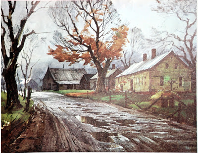
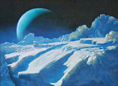
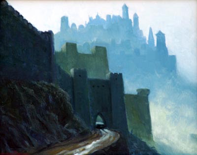
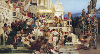
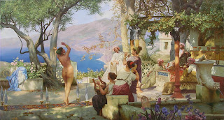
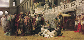
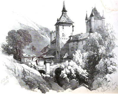
From the soothing, restorative environment of Waterfall City to the hidden wonders of Chandara, acclaimed author and illustrator James Gurney’s magical Dinotopian world comes to life in this enchanting exhibition that features  22 original paintings from the best-selling illustrated books Dinotopia: A Land Apart From Time (1992), Dinotopia: The World Beneath (1995), and Dinotopia: Journey to Chandara (2007), and presents fascinating examples of the illustrator’s creative process, including referencematerials, and a handmade scale-model.  

Inspired by archaeology, lost civilizations, and the art of illustration, Gurney’s Dinotopia, an extraordinary place where humans and dinosaurs live in harmony, fuses fantasy with realism and scientific accuracy. “The thing I love about dinosaurs is that they are on that balance point between fantasy and reality,” says Gurney. “It might be hard to believe that mermaids and dragons really existed, but we know that dinosaurs did―we can see their footprints and skeletons but we can’t photograph them or see them, except in our imagination.”

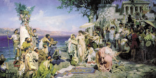
The Dinotopia storyline chronicles the adventures and remarkable experiences of Professor Arthur Denison and his son Will on Dinotopia, a mysterious “lost” island inhabited by dinosaurs and shipwrecked travelers. The faraway land of Dinotopia― wholly the product of Gurney’s fertile imagination, scientific knowledge and meticulous artistic ability―is a civilization like no other. The society has its own language, alphabet (dinosaur footprints that correspond to each letter of the Roman alphabet), colorful festivals and parades. The lively cast of characters includes the inquisitive Professor Denison; Will and Sylvia, the adventurous young Skybax riders-in-training; the devious curmudgeon Lee Crabb; the beautiful musician Oriana Nascava; and a multilingual, diplomatic Protoceratops named Bix.

“We are honored to present this exciting collection of original works by James Gurney,” said New Hampshire Institute of Art Illustration Chair Jim Burke. “This is t the first of what we hope will be many collaborations with the Norman Rockwell Museum.”


THE MAN BEHIND DINOTOPIA
James Gurney lives with his family in New York State’s Hudson Valley. He was born on June 14, 1958, in Glendale, California. As a young boy, he found it difficult to find books on dinosaurs, a subject that always captivated him. A childhood museum visit provided his first encounter with the skeleton of a formidable Allosaurus, leading him to imagine the dinosaur skeletons “stepping off of their platforms and tip-toeing through the hallways at night,” returning to their post by daybreak.

Gurney’s youthful daydreams inspired an interest in archaeology and lost civilizations. The artist recalls many hours spent excavating his suburban backyard for arrowheads and “even a lost temple.” During college he majored in anthropology at the University of California at Berkeley, where he received a B.A. in 1979 with Phi Beta Kappa honors. From there he went on to pursue his lifelong interest in art, studying illustration at the Art Center College of Design in Pasadena, where he met his wife Jeanette, also an artist, who shared his love for sketching outdoors.

A cross-country trip with friend and fellow artist Thomas Kinkade resulted in The Artist’s Guide to Sketching (1982). During his early career he painted jungle and volcano backdrops for animator Ralph Bakshi’s Fire and Ice(1983) and became interested in the fantasy genre. His art soon appeared on the covers of science fiction and fantasy novels but his big break as an illustrator came from National Geographic magazine with a series of challenging assignments working with scientists and historians to recreate ancient worlds. Gurney’s secret dream was to discover a lost city as significant as Troy or Machu Picchu and so, in his spare time, he envisioned and painted Waterfall City and Dinosaur Parade, which inspired the conceptual framework for Dinotopia.

His first Dinotopia book, the New York Times bestseller Dinotopia: A Land Apart From Time, appeared in 18 languages in more than 30 countries and sold two million copies. Gurney has written and illustrated three other volumes in the series, Dinotopia: The World Beneath, Dinotopia: First Flight, and Dinotopia: Journey To Chandara. In 2002, Hallmark Entertainment produced a lavish $86 million television miniseries for ABC-TV based on the Dinotopia books that received record-setting ratings and an Emmy award for best visual effects.

Norman Rockwell Museum
Founded in 1969, Norman Rockwell Museum is dedicated to education and art appreciation inspired by the enduring legacy of one of America’s greatest artists. The Museum houses the world’s largest and most significant collection of original Rockwell art, and presents the works of contemporary and past masters of illustration. The Norman Rockwell Archive contains more than 200,000 photographs, letters, and other ephemera. In 2008, the Museum was awarded the National Humanities Medal, which honors individuals or institutions whose work has deepened the nation’s understanding of the humanities.

The Museum is located in Stockbridge, MA, where Rockwell spent the last 25 years of his life. In 1993, the Museum moved from its original home at the Old Corner House on Stockbridge’s Main Street to its present location, a 36-acre site overlooking the Housatonic River Valley. Architect Robert A. M. Stern designed the Museum gallery building.

About the NH Institute of Art: Established in 1898 as the Manchester Institute of Arts and Sciences, the New Hampshire Institute of Art has had a firm commitment to educating diverse traditional and nontraditional students in the fine arts.

The Institute offers a Bachelor of Fine Arts degree drawing undergraduate students from across the United States and Canada. Its Certificate Programs and a Continuing Education program attract and engage community members from throughout New England. Dedicated faculty promote intellectual and artistic development and teach students to respond artistically to contemporary social, political, and aesthetic issues.

The New Hampshire Institute of Art is accredited by the National Association of Schools of Art and Design and the New England Association of Schools and Colleges.

The mission of the Sharon Arts Center is to engage the community in the artistic process, to support and serve artists and craftspeople, and to foster the relationship between artists and the community through education, exhibitions, and the promotion and sale of arts and crafts as well as through special programs and events. The Sharon Arts center offers a wide variety of art classes and programs in the school facility in Sharon, NH.


More on Translation

$
0
0


by
Armand Cabrera


Translating is important  to understand if you want to paint in a representational style. Translating is more than just converting what you see in the real world into two dimensional shapes, its also important to key the painting in a number of ways.  Keying a painting is part of translating what you see.  It is what we really do when we paint and especially when we paint from life. 


Pigment can’t get the real amount of saturation or values of light and darks of nature. An artist has  to paint the relationshipsof what they see, editing them down to fit into the ranges available to the limited properties of their colors.  Artists have to key a limited set of paints to represent everything from white equals the orb of the sun to black equals the shadow under a rock in pigments. The same limitations apply to all aspects of the image drawing, color and every aspect of the scene in general- contrast, edge quality, details. 

A good painter gets the relationships to read properly relative to everything else in the scene. A weak painter gets none or some to read right but puts unnecessary emphasis or importance to other elements breaking the harmony of the picture as a whole.


As long as the painting has this internal consistency of handling it will be successful. It's not any one thing but the relation of all things and the vision the artist has for  the image. This is what is really happening when we paint and why it is important to be aware of the whole painting at all times while we paint. The translation must be uniform to make it believable  and incorporate the artists intent for the finished image. These relationships and hierarchies of the translated world create mood and veracity in the image. 


Paintings from top to bottom
I. Levitan, D. Bunker, H.Von Zugel, I. Shishkin, H. Herzog
Viewing all 171 articles
Browse latest View live